Monday, 20 May 2013

D&AD brief


This is my final design for the Batiste D&AD brief, I had to create four scents and identities for the dry shampoo brand. The brand has a quirky and playful identity which needed to be portrayed through the designs. I decided to create a British picnics theme as the types of food scents where appealing and unusual, for the style of the packaging I felt that a vintage and shabby chic trend would suit this theme well. 

Work produced on the placement with The Point


Fathers Day and Easter point of sale:

I was asked to produce Fathers Day and Easter point of sale posters for the client The Factory Shop. For the Fathers Day I created a retro style and focused the design of the typography, and for the Easter design I created patterned easter illustrations with soft colours to fit in with the theme of the occasion.


Alternative business card:

I was asked to create an alternative business card which could be posted out to potential clients to make them aware of the services The Point could provide for them, the design needed to make the potential client more involved so it would be memorable, however I was told it had to be cheap to produce and post out.

As The Points branding has a yellow duck I thought a good idea would be to post out a template of a origami duck which could be made by the receiver, this meant the design would be interactive. I designed the template by making one by hand and then creating it on illustrator, I branded the duck with the logo on the side. I then created a large buisness card which was the same size as the un-made template so they could be posted together, it follwed The Points brand idendity and on the back I created step by step instructions on how to fold it.


Infinite Energy:

I was given a brief to re-design the logo for Infinite Energy, a solar energy installation company, I needed to create the logo with a similar 8 symbol to the original. These where the design ideas I created, I then designed a brochure and letterhead design for the logo which was put forward for the pitch to create a style for the brands identity.


Foundation of Light

I was given a brief for a pitch to create the editorial design for the Foundation of Light annual review, this is the style that I created. I used a red, white and grey colour palette as they represent the charities and football clubs colours, the main font and text boxes have pat rounded edges and a line of spots create a flow through the pages.


Tuesday, 19 March 2013

Wedding Stationary


I have designed the wedding stationary to go with the invites I created a few months ago, I carried on the style throughout the menu, table plan, signs and placeholders. The designs use a variety of 50's style fonts and I created a feather love-heart illustration to create a visual focus, to stop the design looking too flat I created an aged texture background.

A talk from Seb Lester


Seb Lester is a professional type designer and calligrapher, he came in to give a talk to the class about his design career journey. He started as a student, mainly creating photorealistic paintings, after finding a book in the library on letterforms, he developed a passion for typography. After he finished his course he worked designing album covers for three years, however he wasn't happy with the job and eventually got himself a job as a Type Designer, Seb then went on to produce corporate typefaces for a range of companies such as Intel, Waitrose, The Daily Telegraph and Barclays, he also designed several typefaces which have then been bought and used by a variety of brands.

Seb felt he had no recognition from his successful career although his typefaces where used everywhere, as creating a typeface is quite anonymous, so he started to design more creative types, combining his designs with 3D and animation, however not many people liked what he had created. H then moved onto creating flat prints of creative type using memorable quotes and words, his designs where eventually recognised and have been used for Levi clothing and BMX.

Seb now focuses on calligraphy, he believes that working with typography and calligraphy together has helped him develop his skills when creating letterforms, he describes himself as obsessed with creating letters and words, spending most of his time writing letters and words. Seb finished his presentation with some advice on how to be a successful designer, he believes that passion for the subject is necessary to succeed.

Friday, 1 March 2013

New CV design


I have created myself a new CV to show off the skills I have learnt and developed over the last month as I want to start emailing studios so I can find a long term work placement for my final year.

Friday, 22 February 2013

Work Experience at The Point Design

I am currently doing a work placement at The Point Design, a Graphic Design studio based at The Toffee Factory. So far I have found the experience really helpful and it has given me an insight to what to expect when working in  industry. I have enjoyed the fast paced approach to work, in the past week I have worked on three briefs rather than working on one project over six weeks, I have also been introduced to working with a new program which is similar to InDesign, Quark.

The previous project, Digital Applications has really prepared me well for work experience, every day I have been able to apply a lot of techniques that I learnt in the sessions. Alongside my work placement I have been working on my D&AD brief in the evenings, this has given me even more practice using Illustrator and Photoshop, as a result my confidence has really grown, I feel that I am really heading in the right direction with the course.

Tuesday, 19 February 2013

PNE start up your own business short course


I recently finished a four week short course on how to set up your own business which is run by PNE enterprise. I found the course very useful as it provided me with all the information on what steps I need to take to enable me to start up my own freelance graphic design business, an option I want to consider in the future.

The course gave advice on how to write up a business plan, what financial help is available, information on how to manage tax and national insurance, what market research should be done and any important details regarding the law.

Now that I have all these resources  I am going to write up a draft business plan so that I will remember and have a reference of all the of information I have learnt, I will then be able to apply these skills in any future career choices.

Wednesday, 13 February 2013

Wedding Invitations


This the invitation I designed in collaboration with Phil Bailey for a friends wedding which is in July, I really enjoyed working as a group to develop the design, it has been inspired by Native American patterns and the style focuses around a variety of fonts.


Tuesday, 5 February 2013

Tuesday's Session 5th Feb

In todays session two graphic designers from ClicTime, a company extended from Lego, came in to speak to the class. They explained how their personal career journeys have progressed from being students at Newcastle College to working for a multinational company. Their job descriptions include designing a range of lego clocks and watches to designing a fashion range for a branded surf festival.

After showing a selection of products they design and explaining how they work, they went on to tell the class about a work placement opportunity available and how to apply for it.

Friday, 25 January 2013

Family Explorers


I was part of the brand development group for Family Explorers, a scheme which encourages families in the North East to visit their local cultural sites of interest. This was my idea which I put forward and developed, I designed these characters to represent the brand, they would be used for the children's scrap books, passports, calendars and other printed documents. I created the characters with a retro 50's style illustration which grungy colouring. The logos where developed from my original design (the coloured binoculars) the group liked the idea of using a passport stamp style logo so integrated my design into a stamp.

Magazine insert revisit


I have been having problems with my memory stick that contains all of my first year work, as a result I have lost all of my final pieces, I will always remember to back up everything twice from now on! This has become a problem especially as I want to put a portfolio together, I have decided to redo the pieces I want to put in my portfolio. This is the magazine insert I designed for Typ, a graphic design magazine. Although I have found that it has given me an opportunity to improve my design, I altered the typography a little and changed the colour palette, I also added sample text and arranged the images so it has a better composition. This is the template, I will be printing it out and photographing it to show how it would look folded.

Thursday, 22 November 2012

Packaging Design


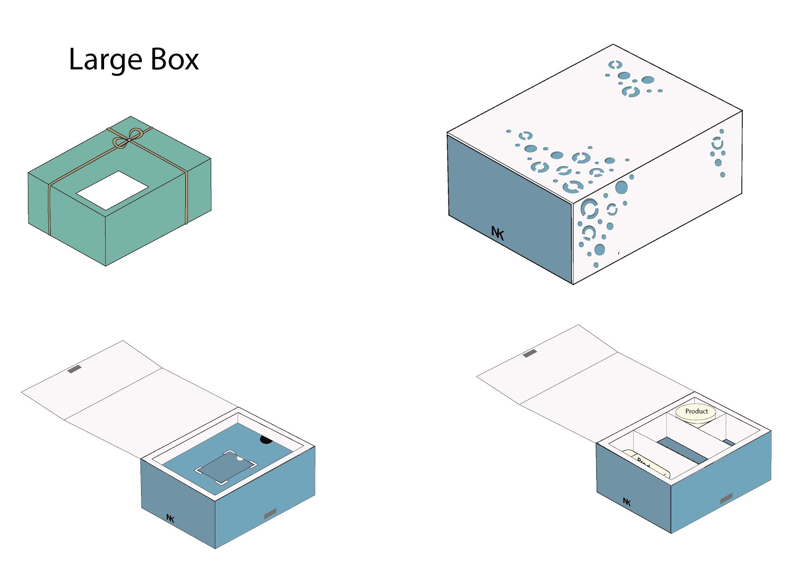
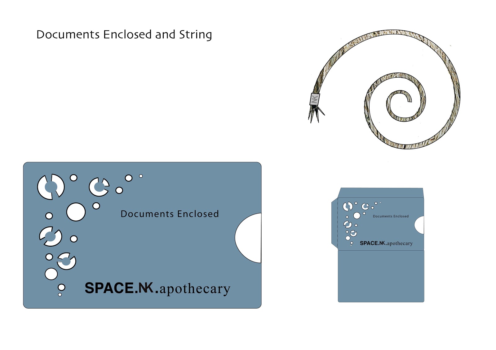
These are final designs for the packaging brief, my task was to create a range of postal packaging designs for SPACE.NK.apothecary, a high end bath and beauty online store. My development led me to this design where I incorporate the laser cutting techniques to create a layered box, where the pattern is cut away from the outer layer to reveal a colour underneath. I wanted the box to be of a contemporary style with aspects of traditional to work with the brand name and values.


Sunday, 20 May 2012

Newcastle Medical Photography


These are my second design ideas for the Newcastle Medical Photography, I decided to break down the appearance of a camera to a simple design either with the lens or the flash. I chose a very basic colour scheme to keep to a contemporary style, using grey and blue or orange. I used an abbreviation for the name which fitted to the logo with the full name written underneath using a clear typography.

Newcastle Medical Photography Logo


These are my logo design ideas for Newcastle Medical photography. Newcastle Medical Photography is a department of the hospital which specializes on medical photography which is used for documenting, teaching, publications and for evidence in court cases. I found this brief quite challenging as the brief was quite restricted and it was quite easy to fall into the trap of using cameras. 


For this logo idea I focused on the medical theme of the company, The Red Cross and cameras was the inspiration for this logo, half a medical cross which also appears to be a birds eye view of a camera with the department name fitted to the right side of the logo, I chose to work with blue and green as these colours are not too bold and are often associated to medicine. To add detail I experimented with overlapping and opacity, my favorite design is the middle one as it is more interesting with the three shades of colour created by the opacity tool on Illustrator.

Thursday, 17 May 2012

Work Based Learning Project


This is what I have been working on for the Badboy brief. I have created three ranges of clothing each with a different approach for the logo design. I decided to create two designs to be of a style usually associated with this type of clothing, the third has been influenced by contemporary fashion brands to offer a fresh approach to this type of clothing.


week 14/05/12


This week I have been very busy with the work based learning project as the deadline is this Friday at 3pm. My main focus this week is to finish the clothing designs on the computer and create a design for presenting my ideas to the client, there are also lots of loose ends I need to complete for the deadline such as my digital skills, completing my proposal and annotating my book.

Wednesday, 9 May 2012

Editorial Design


Here is my final pieces for the Editorial Design project, for this project I designed a 4 page article on Made Thought, a graphic design company. The project focused on the typography and layout of the article, I did this by looking at Si Scott and Ryan McGuinness, Graphic designers who style focuses on elaborate typography using swirling designs and layers. I decided to design the article in a contemporary and minimalist style which focused heavily around the elaborate typography in the center of the page. I wanted the supplement to catch the attention of the reader so I designed the folding so that the four pages open out onto one spread creating a staggered background to work the designs into. 

Friday, 23 March 2012

Week 19/03/11

We have now made a start on our final project. This project requires me to complete two briefs and write a proposal. The brief I have chosen for the project and proposal is for a brand called Badboy. The company sell products for martial arts fighting, particularly clothing used for training. I have chosen this brief as I have not worked with clothing before. I also have previous experience with this type of culture as I worked in a bodybuilding  gym for two years and have an idea of the type of clothing these men want to wear.  On Tuesday I wrote a plan for the proposal, I aim to have the full proposal finished by next Tuesday.  

For contextual studies I completed the essay plan on for Tuesdays tutorial. I want to have the first half of the essay draft done by next Tuesday, I will be working on this over the weekend. In todays lesson (Friday) I am updating my blog and working on the NHS brief where we have to design a logo for the Newcastle Medical Photography Department. I am starting my ideas for the  design by researching other medical photography logos. I will then start to mind map and sketch ideas. 

Saturday, 25 February 2012

Subeaze Flyer

We were asked to create a flyer for Subeaze. The flyer is intended to advertise the company to construction workers currently close to finishing their current work. It will be placed around construction sites in places used by the workers such as toilets and canteens.  I wanted the flyer to be eye catching and easily read so I used a white background to emphasize the text and images. For the imagery I created silhouettes of common tools found on construction sites so that the viewer can relate the contents of the flyer. I kept the information very simple and used a question to draw the reader in. 

Design a Twizy

Here is my entry for the design a Twizy brief.